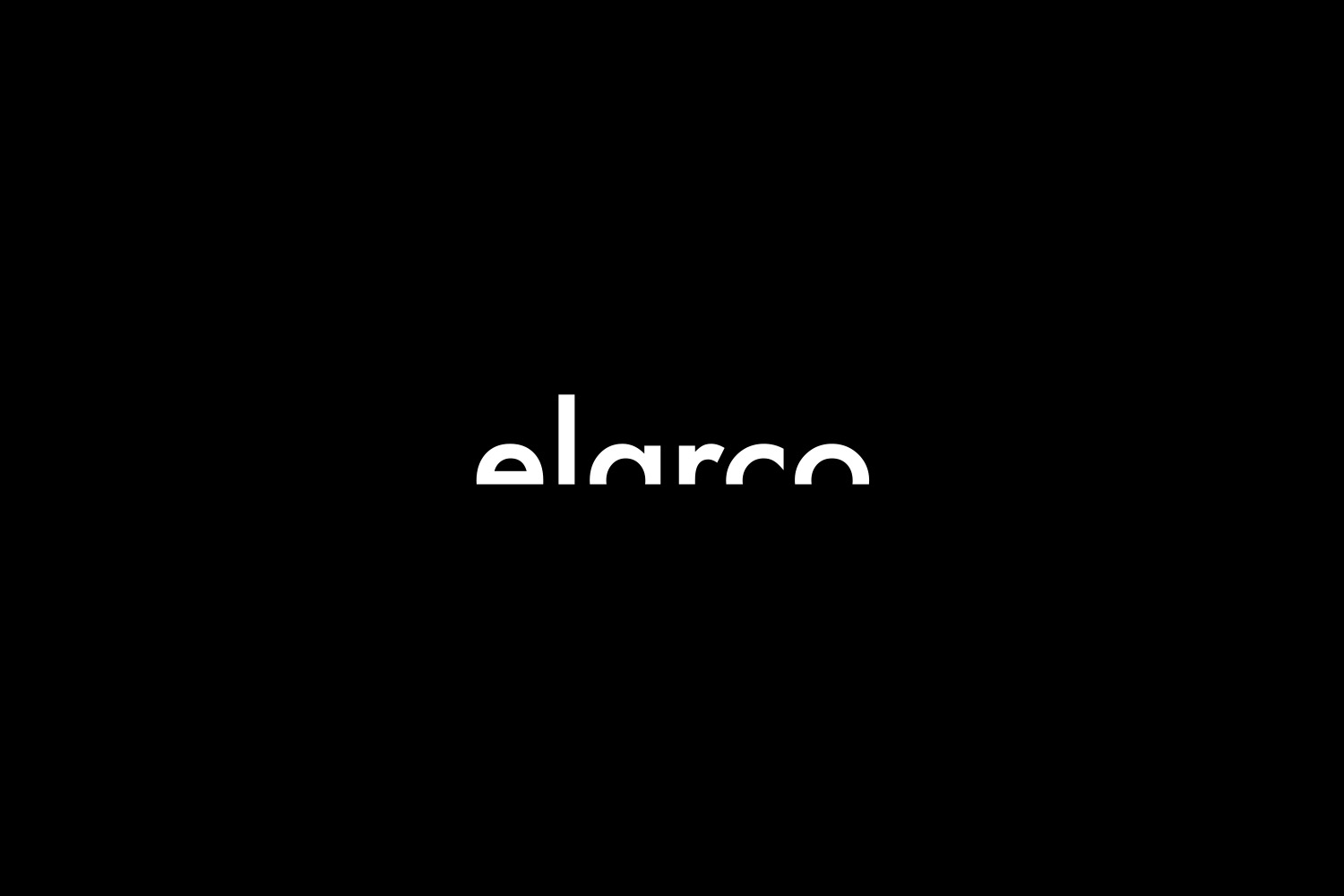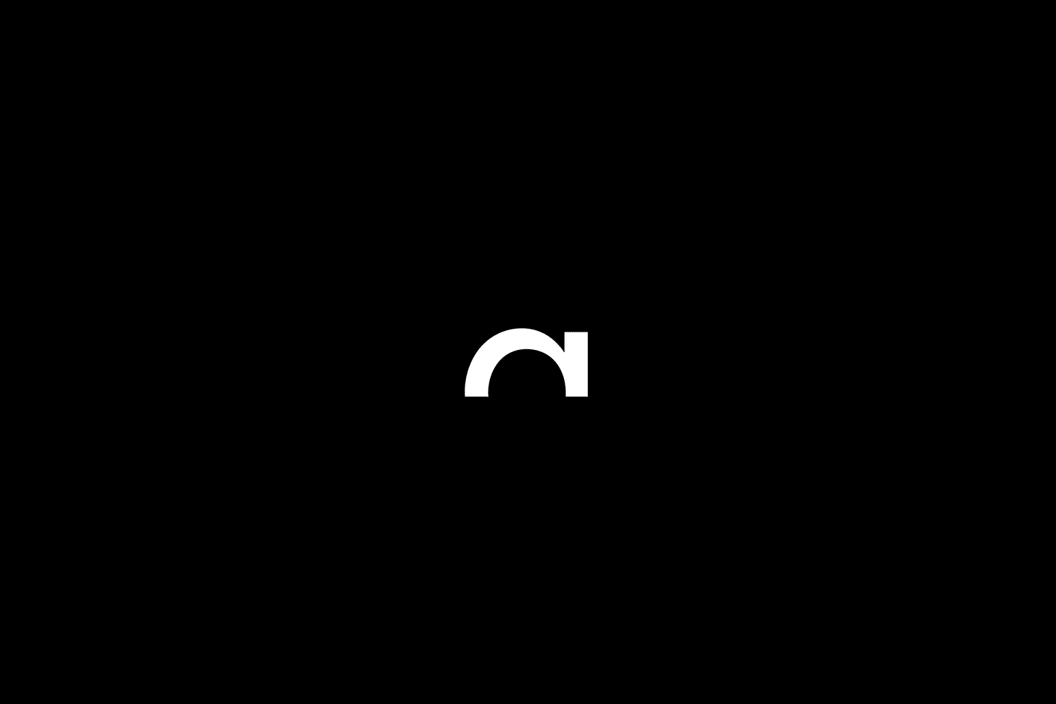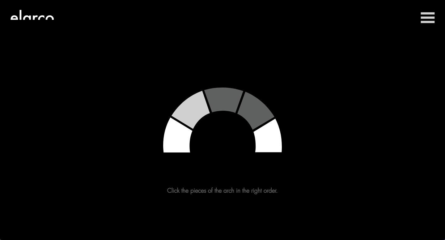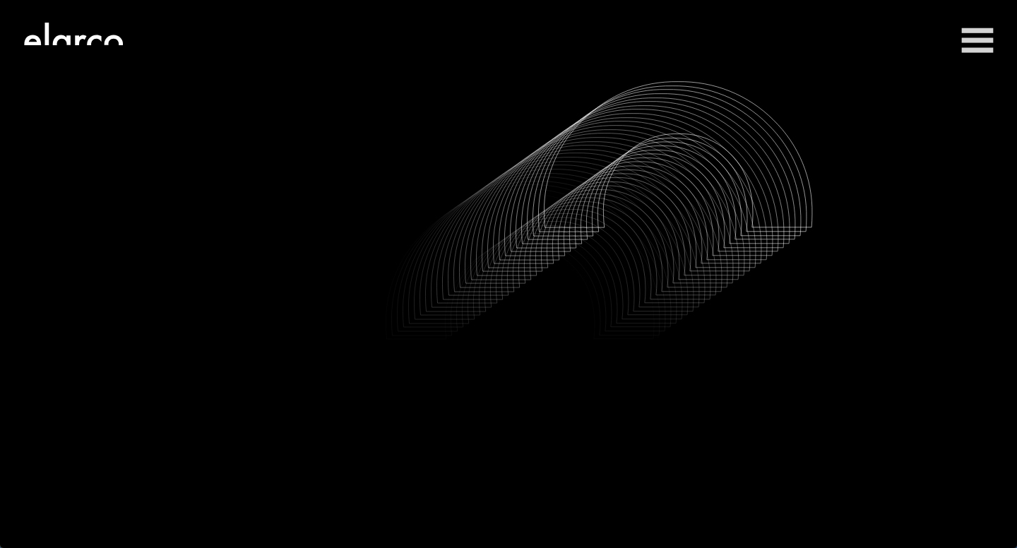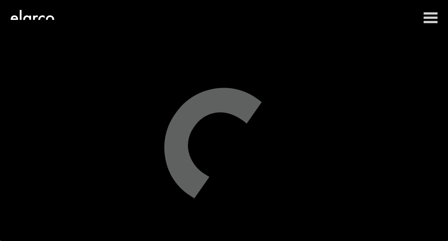
Concept
Brand identity and website for product consultancy elarco with a unique interactive experience. For the creation of the design, we took the name of the brand as a starting point to create a typography that would represent them. Following their minimalistic approach to design, we realised that just by cutting the bottom half of the Futura font we ended up representing the company's naming, the arch. Sometimes at achos! less is more, too!